


Media Query
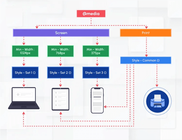
Media query is the CSS technique introduced in CSS3. Media queries apply to styles to elements based on media/device type (ex. Screen, print) or some other specific characteristics with parameters (ex. max-width:700px).A media query is an HTML/CSS functionality that allows the content of a Web page to adapt to the type of media that the page is being rendered in, such as a computer screen or that of a phone or tablet. This is considered as a core technology for implementing Responsive Web design and was recommended for implementation as a standard in June of 2012 together with other CSS3 functionalities.
Why is it needed?
Nowadays it is very common for the user community to access any website using laptop/desktop/mobile/etc., (different sizes of the devices). Media Query is very useful to develop responsive websites. It’s essential for any form of mobile responsive design. Search engines also give higher ranks/preferences to websites that are fully responsive.
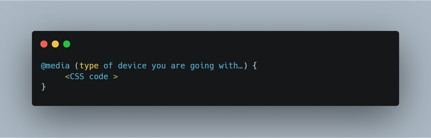
Media query syntax:
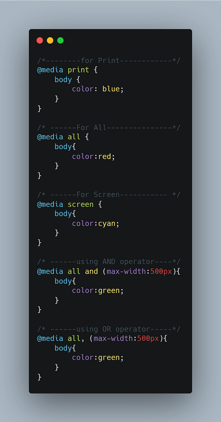
Some basic media queries with AND, OR operator which is very useful for any developer. (for AND we use and) but (for OR we use ,)
Note:-
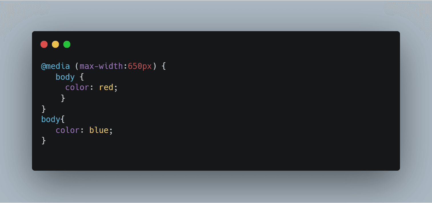
Read the code from top to bottom. Here, the body color is red till 600px. After that it will be blue.
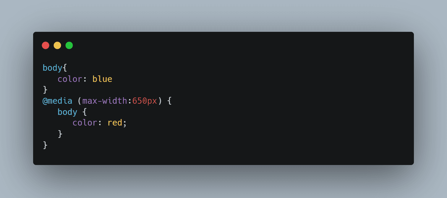
2) It always goes with the bottom selector if the selector has the same specificity. For e.g., here, body is the element which is being used as the selector. So, the body color is always going to be blue.
Few Features of Media Queries:
1) width (min & max prefix applicable. e.g., width, min-width, max-width)
- Width of the viewport which includes the width of the scrollbar.
@media (width:100px) {….}
@media (max-width:200px) {….}
@media (min-width:300px) {….}
2) height (min & max prefix applicable)
- Height of the viewport.
@media screen and (max-height:1200px) {…..}
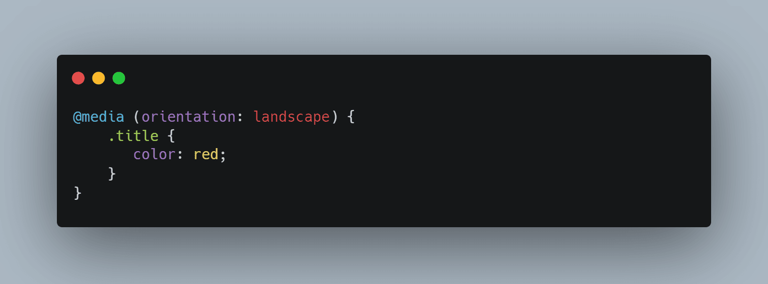
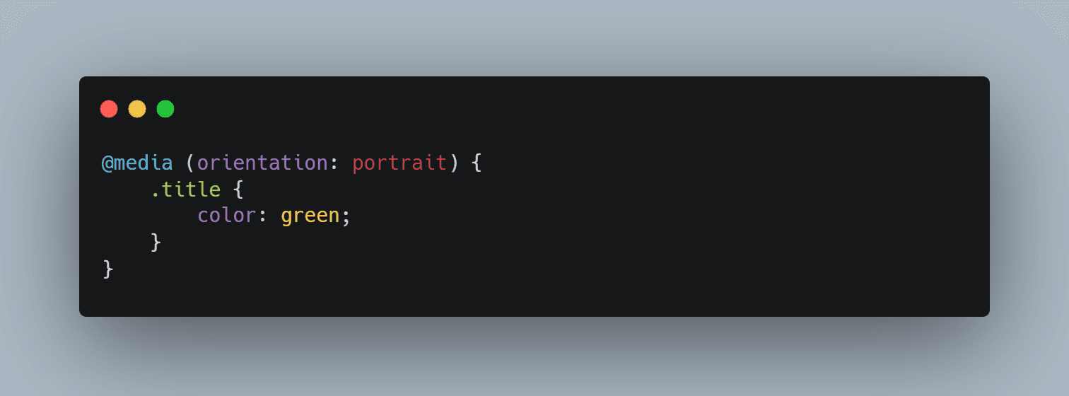
3) orientation
- Orientation (portrait/landscape) of the viewport.
@media screen and (orientation: landscape) {..}
Landscape
E.g., when width becomes wider than height then it comes under landscape
Portrait
E.g., When height becomes wider than width then it comes under portrait
4) resolution (min & max prefix applicable)
- Pixel density of the output device.
@media screen and (min-resolution:72dpi) {..}
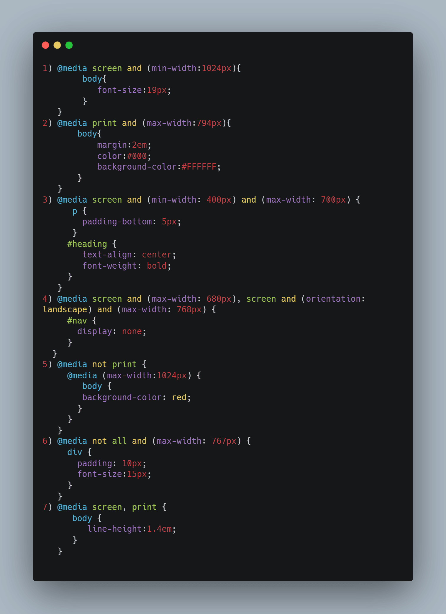
Different media queries examples:
Use Case:
Media queries are useful when you want to modify your site or app depending on a device’s general type (such as print vs. screen) or specific characteristics and parameters (such as screen resolution or browser viewport width).
Websites are commonly designed with screens in mind, you may want to create styles that target special devices such as printers or audio-based screen readers.
Benefits of Media Query over CSS:
It not only allows you to vary viewport dimensions based on screen size, but also can help you set different style properties for different devices, including color schemes, font styles, motion settings and animations, borders and spacing, and almost any other CSS property you can think of.